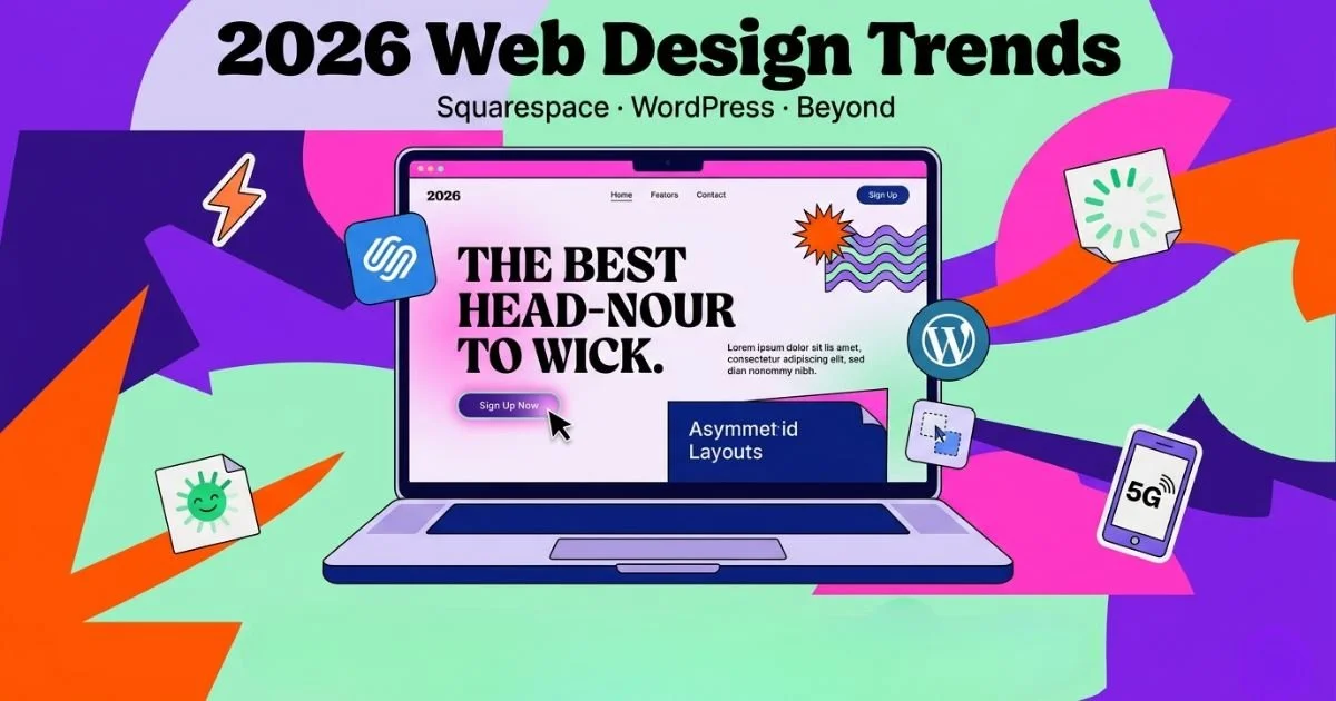
2026 Web Design Trends: Your Cheat Sheet for Squarespace, WordPress & Beyond
You know that feeling when you visit a website you haven't seen in a while and think, "Wow, this looks… old"? The fonts feel dated, the layout feels cramped, and something just feels off. That sinking sensation is the digital equivalent of showing up to a party in last decade's fashion.
Here's the uncomfortable truth: your website is probably the site someone is on right now.
Web design doesn't stand still. What felt fresh and innovative eighteen months ago can today feel as stale as week-old bread. And here's the kicker—your visitors notice. They might not say "gosh, this site lacks modern micro-interactions," but they'll feel it. They'll trust you a little less. They'll bounce a little faster. And they'll take their business to a competitor whose digital shopfront feels current and trustworthy.
So whether you're building on Squarespace's elegant simplicity, wrestling with WordPress's limitless flexibility, or considering a complete platform switch, understanding where web design is heading isn't optional anymore. It's survival.
Let's cut through the noise and look at what actually matters for 2026.
Why Bother Keeping Up? It's Not Just About Looking Pretty
I know, I know. You're busy running a business. Adding "stay on top of web design trends" to the to-do list feels like a chore. But think of your website as your digital shopfront. If the paint is peeling and the signage is old, people walk right past.
First Impressions Count: Users form an opinion about your site in about 0.05 seconds. If it feels dated, they bounce.
SEO Loves Freshness, with GEO, and AEO: Google's algorithms have a soft spot for websites that are modern, fast, and mobile-friendly. It's a ranking signal. GEO (Geographical Optimization) focuses on tailoring content and keywords to specific locations, enhancing visibility in local search results. AEO (Answer Engine Optimization) aims to optimize content for voice search and direct answers, ensuring that it meets the needs of users looking for quick, concise information. Together, these strategies can significantly improve a website's performance in search rankings.
User Expectations Change: What felt intuitive five years ago might frustrate users today. They expect seamless, engaging experiences.
So, let's get into the good stuff. What are the actual trends you need to know about for your Squarespace or WordPress site?
Key Web Design Trends You Can't Ignore
1. The Micro-Interaction Magic
Have you ever clicked a button and felt a tiny satisfying wiggle, or watched a little animation as you hover over a link? That's a micro-interaction. They're the secret sauce of modern web design.
These tiny moments aren't just for show. They provide feedback, guide the user, and inject a dose of personality into your site. On platforms like Squarespace, you can often add these through built-in animation settings or custom code. For WordPress users, a good page builder like Elementor or a lightweight plugin can bring your site to life with subtle scroll-triggered animations. The keyword is subtle. You want a delightful surprise, not a chaotic circus.
2. Bold Typography Takes Centre Stage
For years, web design was all about the hero image. Now, typography is stepping into the spotlight. We're talking big, beautiful, unapologetic fonts that grab you by the eyeballs.
Why? Because it creates an immediate impact and hierarchy. A bold headline in a unique typeface tells your story before a user reads a single word. Both Squarespace and WordPress offers extensive font libraries and integrations with services like Google Fonts and Adobe Fonts. Don't be shy—pair a chunky serif with a clean sans-serif and watch your design confidence soar.
3. "Brutalism" and Maximalism Creep In
For years, "clean" and "minimal" were the only games in town. Now, we're seeing a rebellion. It's not about being messy, but about being expressive. This can mean:
Raw, unpolished elements: Think stark layouts, exposed grids, and almost "ugly" fonts that are intentionally unconventional.
Layered, bold colours: Moving past safe palettes to clashing, vibrant combinations.
Retro and Y2K influences: That 90s and early 2000s aesthetic is making a weird and wonderful comeback.
For a local cafe or a creative agency, this can be a goldmine for standing out. WordPress, with its limitless customisation, is perfect for this. Even Squarespace templates can be pushed in this direction with clever use of colour, images, and custom CSS.
4. Performance is a Design Feature
Here's a trend that's non-negotiable: speed. In 2024, a slow website is a broken website. It's not just about technical back-end stuff anymore; performance is a core part of the user experience and design.
This means:
Optimised images: No more uploading massive files straight from your camera.
Clean code: Avoiding bloated plugins (looking at you, WordPress) and unnecessary scripts.
Core Web Vitals: Google's set of specific factors it considers important for user experience.
When you're looking at professional SEO services, this is exactly what they'll obsess over. A site that looks stunning but takes ten seconds to load will kill your conversions. It's that simple.
5. The Rise of Asymmetry and Broken Grids
Symmetry is safe. Asymmetry is interesting. Designers are increasingly ditching the perfectly balanced layout in favour of off-kilter compositions, overlapping elements, and intentional "chaos."
This trend creates visual tension and draws the eye exactly where you want it. Imagine a product image bleeding off the edge of the screen, with text layered boldly over the top. It feels dynamic and modern. Both Squarespace's fluid engine and WordPress's flexible builders allow you to experiment with these layouts without needing to be a coding whiz.
Your Action Plan: How to Stay in the Game
So, how do you actually implement this without losing your mind? Here's a straightforward approach:
Audit Your Current Site: Be brutally honest. Does it feel fresh? Load fast? Is it easy on the eyes? Ask a friend for their unfiltered opinion.
Pick One or Two Trends: Don't try to do everything. Maybe you start with refreshing your typography and adding some subtle micro-interactions.
Leverage Your Platform: Dive into Squarespace's style settings or explore reputable WordPress theme shops (like Astra or GeneratePress) and page builders. They often bake these trends right in.
Test, Test, Test: After making changes, check your site on your phone, your tablet, and your desktop. Does the magic hold up everywhere?
Conclusion: It's a Marathon, Not a Sprint
Look, keeping your website feeling current is an ongoing gig. The trends I've mentioned—bold type, micro-movements, expressive layouts, and relentless speed—are your tools to build something that not only looks the part but works hard for your business.
And if the whole thing feels overwhelming? That's fair enough. This is precisely where tapping into seo consulting services or partnering with a dedicated SEO services company can be a game-changer. They live and breathe this stuff. They can help you navigate the technical side (like those Core Web Vitals) while you focus on what you do best. Whether you need local seo services to dominate your suburb or a full-scale seo service to overhaul your online presence, getting expert eyes on your project is never a bad investment.
After all, a beautiful, high-performing website is the best sales tool you'll ever own. Might as well make it a cracker.