
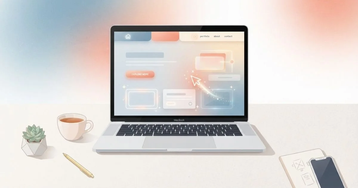
Ever landed on a website and felt... nothing? No little nudge, no personality, just a static page doing its job and nothing more. That's the trouble with a lot of small business sites today. They tick the boxes but forget to charm anyone.
What are the Squarespace Web Design Trends Worth Watching in 2026
Squarespace has quietly become a playground for fixing exactly that problem, and a few trends are shaping how the best sites on the platform look, feel and behave right now.
Microinteractions: The Small Stuff That Makes a Big Difference
Think about the last time a button gently pulsed when you hovered over it, or a form field turned green the second you got it right. Tiny, right? But those little moments are microinteractions, and they're doing more heavy lifting than most business owners realise.
A microinteraction is any small animation or response triggered by a single action — clicking, scrolling, hovering, submitting a form. On Squarespace, that might be a button that lifts slightly on hover, a cart icon that wiggles when you add an item, or a smooth scroll-triggered fade as a new section comes into view.
Why bother? Because these details tell a visitor "this site is alive, someone cared about this." Squarespace's built-in animation settings make basic microinteractions genuinely easy to add, no code required, though a bit of custom CSS can take things further for businesses after a more distinctive feel. Overdo it, though, and it starts to feel like a fairground ride. The trick is subtlety: enough to feel responsive, not so much that it slows the page down or distracts from the actual message.
Accessibility and Inclusivity: Good Design for Everyone
Here's a question worth sitting with: could someone using a screen reader actually navigate your site? Could someone with low vision read your text without squinting? If you're not sure, you're not alone, and it's worth fixing.
Accessible design isn't a compliance checkbox tucked away for legal reasons, though that matters too. It's genuinely good design. Clear colour contrast, readable font sizes, descriptive alt text on images, logical heading structures and keyboard-friendly navigation all make a site easier to use for everyone, not just people with disabilities. Squarespace has been steadily building accessibility features into its platform, from alt text prompts on images to improved contrast checking, following broader Web Content Accessibility Guidelines (WCAG) standards.
The payoff isn't just ethical, either. Search engines reward well-structured, accessible content because it's easier for both bots and humans to understand. A site with proper heading hierarchy and descriptive alt text is doing double duty: helping people navigate and helping algorithms make sense of what's on the page.
Headless CMS Integration: Flexibility Without Losing Simplicity
This one sounds more technical than it is. A headless CMS separates the "back end", where content lives and gets managed, from the "front end", how it's displayed to visitors. Normally, Squarespace handles both ends itself, which is exactly why so many small businesses love it: simple, self-contained, no developer required.
But some businesses eventually outgrow that simplicity. Maybe you need content to appear across a website, an app, and a kiosk display, all pulled from one source. Maybe you want more control over how content templates behave. That's where connecting Squarespace to a headless CMS, or using it alongside API-driven tools, starts to make sense.
Is this for everyone? Honestly, no. Most small local businesses don't need that level of complexity, and bolting one on too early can create more maintenance headaches than it solves. But for businesses scaling fast, running multiple digital touchpoints or managing large content libraries, it's a trend worth understanding, even if you're not ready to jump in yet.
Bringing It All Together
None of these trends work in isolation — they're really about the same underlying idea: a website that respects the person using it. Microinteractions make a site feel responsive. Accessibility makes it usable by more people, more easily. Headless integration gives growing businesses room to breathe as their needs get more complex.
You don't need to chase every trend at once. Start small, maybe a hover effect here, an accessibility audit there, and build from a website that already works hard for you. Because at the end of the day, good web design isn't about looking clever. It's about making someone's visit just that little bit easier, and just that little bit more memorable.
If you're looking to implement these trends effectively, working with a Squarespace web designer can help you craft a site that truly stands out.